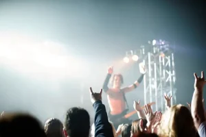

This guide explains why colorful music videos aesthetics work so well on screen, how color theory shapes mood, and how directors and production designers build palettes that stick in viewers’ minds. You will learn how to choose a color scheme, how lighting changes what a color feels like, and how set design and wardrobe keep a visual world consistent. Along the way, you will see real examples from well-known videos and practical steps you can apply to your own projects.
Why Color Matters So Much in Music Videos
Music is an emotional medium, and color works on emotion before the viewer consciously thinks about it. A saturated red frame can feel urgent. A washed-out blue can feel distant. When a video pairs color with rhythm, the image and sound reinforce each other. That is a big reason colorful music videos aesthetics remain popular across genres, from pop and hip hop to indie and electronic music.
Color also helps viewers remember a track. Many fans can recall a song’s video by one striking hue, such as a neon pink wall or a golden field at sunset. A distinctive palette acts as a visual signature, and it can make a video easier to share across social platforms, where people scroll quickly and need an immediate hook.
Core Color Theory for Video Directors
Color theory gives directors a shared vocabulary. The color wheel shows how hues relate. Complementary colors sit opposite each other, such as orange and teal, and they create strong contrast that draws the eye. Analogous colors sit next to each other, like blue, blue-green, and green, and they create calm harmony. Triadic schemes use three evenly spaced hues for lively variety.
Saturation and value matter as much as hue. Highly saturated colors feel energetic and loud. Desaturated tones feel subdued or nostalgic. Value, which describes lightness or darkness, controls contrast and depth. A video with strong value contrast often feels bold even if its palette is small.
Warm and Cool Temperature
Warm colors such as red, orange, and yellow tend to advance toward the viewer. Cool colors such as blue, green, and violet tend to recede. Directors use this to guide attention. A singer lit in warm tones against a cool background will often stand out clearly from the scene.
Building a Palette for the Song
Start with the song itself, not the camera. Listen for the emotional arc. Does the verse feel intimate, while the chorus explodes with energy? Map colors to those shifts. A muted palette for the verse and a brighter, more saturated palette for the chorus can make the structure visible without any editing tricks.
Limit the palette to a few core colors, typically three to five, plus neutrals for balance. Too many hues can feel chaotic and dilute the identity of the video. Many successful productions choose one dominant color, one supporting color, and one accent that appears sparingly in key moments.
Test the palette on location and in camera before committing. Digital screens, print proofs, and phone displays can shift colors noticeably. A quick test shoot with lighting and wardrobe samples helps the team confirm that the palette works in real conditions.
How Lighting Shapes Color on Screen
Lighting changes everything. A color that looks perfect on a swatch may turn muddy under tungsten light or flat under overcast daylight. Gels, which are colored filters placed over lights, allow crews to add precise hues to a scene. Practical lights, such as neon signs or lamps visible in the frame, can anchor a palette in a believable space.
Color temperature also matters. Daylight tends to read around 5600 kelvin, while tungsten sits closer to 3200 kelvin. Mixing these sources without correction can create unwanted color casts. Many crews balance their lights carefully or intentionally mix them to create stylized contrast, such as warm practicals against cool daylight.
Camera settings affect color as well. White balance, exposure, and the chosen color profile all change how hues render. Shooting in a log profile can preserve more detail for grading, which gives colorists room to shape the final look. Consistency across shots is essential, because viewers notice when skin tones or backgrounds shift unexpectedly between cuts.
Production Design and Set Choices
Production design turns a palette into a physical world. Set pieces, props, walls, and floors should support the chosen colors without overwhelming the performer. A bright backdrop works best when the wardrobe contrasts with it. A monochrome set can make a single colored object pop.
Wardrobe and makeup extend the palette onto the body. Costume designers often coordinate with the director to match or intentionally clash with set colors. Makeup can echo an accent hue in the eyes or lips, tying the performer to the environment. Consistency between costume and set helps the video feel deliberate.
Practical effects such as paint, fabric, and gels can produce textures that digital color grading cannot easily replicate. Many productions combine physical design with post-production to achieve a finished look that feels rich rather than artificial.
Color Grading in Post-Production
Grading is where many colorful music videos aesthetics come together. Colorists adjust contrast, saturation, and hue to unify shots shot at different times or under different conditions. They also create stylized looks, such as teal and orange grading for cinematic contrast or faded film tones for a vintage feel.
Work from a reference frame. Choose one still that represents the intended mood and match other shots to it. Check the grade on several screens, including phones and laptops, since viewers watch on many devices. A grade that looks stunning on a calibrated monitor may appear dull on a budget display.
Avoid overprocessing. Heavy saturation can crush detail and make skin look unnatural. Subtle adjustments usually feel more professional and hold up better over time.
Real-World Examples of Strong Color Use
Many well-known music videos show how palette choices support a song. Some directors build entire videos around a single dominant hue, letting shifts in lighting and wardrobe create variety. Others use bold contrasts, such as neon colors against dark urban backdrops, to suggest energy and rebellion. Studying these examples helps creators see how theory becomes practice.
When reviewing references, focus on why a color appears, not only how it looks. Ask whether the hue reflects the lyric, the tempo, the character, or the setting. A color choice that answers one of those questions usually feels intentional to viewers.
Common Mistakes to Avoid
The most frequent mistake is choosing too many colors. Without a clear hierarchy, the frame feels busy and the viewer struggles to focus. Another error is ignoring skin tones. Performers should look natural and healthy in every shot, even in stylized palettes.
Teams also underestimate consistency. Shooting multiple locations with mismatched lighting can break the visual identity. Plan a color script or moodboard before the shoot, and check it during each setup. Finally, avoid chasing trends without purpose. A palette that fits the song will age better than a palette that only copies a current fad.
Summary
Colorful music videos aesthetics depend on a clear plan. Color theory provides the vocabulary, the song guides the palette, and lighting determines how colors actually appear on screen. Production design and wardrobe extend the look into physical space, while grading unifies everything into a final image. Limit the palette, test it in real conditions, and keep skin tones and consistency in mind. When these elements align, the video becomes memorable, shareable, and true to the music.
Frequently Asked Questions
1. How many colors should a music video palette include?
Most effective palettes use three to five main colors plus neutrals. This range gives enough variety to keep images interesting while maintaining a clear visual identity that viewers can recognize and remember easily.
2. Does color grading change the mood of a music video?
Yes, grading has a strong effect on mood. Warm adjustments can feel nostalgic or intimate, while cooler or more saturated grades can feel energetic or futuristic. Small changes often shift emotion more than people expect.
3. What lighting is best for colorful music videos aesthetics?
Gels on key lights, practical lamps in frame, and controlled backlighting work well. Balancing color temperature matters too, since mixing daylight and tungsten without correction can create unwanted color casts across the whole scene.
4. How can small creators achieve vibrant colors on a low budget?
Choose a limited palette, use colored gels or inexpensive LED panels, and plan wardrobe around the scheme. Test shots with your phone or camera, then adjust white balance and grade carefully to keep skin tones natural.
5. Should colorful music videos always use bright, saturated tones?
No. Saturation should match the song’s emotion. Quiet or reflective tracks often benefit from muted palettes, while upbeat songs may suit brighter tones. The goal is alignment between color and meaning, not constant intensity.